
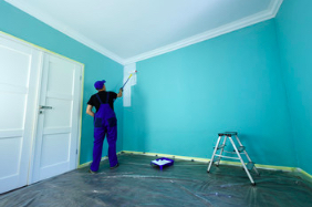
Painting is a quick and inexpensive way to refresh an entire room. It can also add to a home’s resale value. Despite the many different paint colors available, choosing one that best suits your home’s style is important. The following tips can help you make the right decision.
A popular choice for contemporary homes, Glidden’s Red Delicious is a vibrant yet soothing hue. This shade pairs well with white trim and doors.
Warm neutrals are a go-to option whether you prefer traditional or contemporary styles. Beige, tan, and cream shades are easy on the eyes, create a sense of warmth and coziness, and work well with various furniture and accent colors. These neutrals are also great for balancing out cooler tones in your home.
To choose a warm, neutral shade, consider the color’s undertones. Shades with warm undertones (reds, yellows) advance toward the eye and appear more active, while cool tones (blues, greens, violets) recede from the eye and appear more calming.
Another way to tell if a paint color is warm or cool is by assessing its Light Reflectance Value (LRV). A warm tone will appear golden and glowy in natural light, while grayer shades look cooler under less direct sunlight.
White is the classic go-to neutral, but it’s important to know that white paint shades have a wide range of undertones that affect their overall look. Shades with gold or golden-beige undertones like Ballet White and Sherwin Williams White Duck are warm neutrals, while Sherwin Williams Shoji White has a more cool undertone.
A greige is the perfect balance between gray and beige. Soft neutrals like Sherwin Williams Agreeable Gray and Sherwin Williams Silver Lake are popular greige paints. Sherwin Williams Yukon Sky is a lighter, cooler version of greige that works well in north-facing rooms with more blue light.
Try darker hues like Black Forest Green from Benjamin Moore’s Historic collection if you want to get a bit more adventurous with your greige. This rich, greenish-blue is a modern take on the traditional classic and can be balanced with cooler elements such as gray decor.
Even though the color black is technically neutral, it can still add interest to your room. Use this versatile color sparingly with your other neutrals to maintain a clean, polished look.
With their nod to precious gemstones, jewel-tone hues offer a rich, saturated option that can elevate a room. From a deep sapphire blue to a rich amethyst purple or citrine yellow, this regal color palette has the power to bring an instant sense of elegance and elevation.
Jewel tones can be intense for contemporary homes, but using them sparingly as accents or full wall colors can soften the look and make them feel more understated. To help balance out the high quotient of saturated hues, add a lot of neutrals in the form of window trim, area rugs, or cabinetry.
Incorporating texture into your jewel-toned palette can also help soften the overall feel of a space and keep it from feeling too overpowering or OTT. Choose fabrics like velvet or faux fur that offer a soft, luxurious touch to your jewel-toned paint colors.
While jewel-toned hues work well with various fabrics and textures, they pair wonderfully with metallics like gold and bronze. Add some shimmer to your space with jewel-toned strip lights (popularized through TikTok) or a shiny chandelier for a truly luxurious aesthetic.
As a bonus, many of the most popular jewel tones fall into the green and blue family of hues. These saturated shades work beautifully with various natural wood stains, neutrals, and other warm tones like brown and cream.
Whether you’re going for an earthy, teal vibe or something more vibrant, consider bringing in some greenery to compliment your jewel-toned walls. Adding just one solitary plant to your home can instantly boost the look of your room and help offset the richness of the color palette.
Choosing the right shade of jewel-toned paint is essential to creating the right look. Fortunately, ECOS Paints offers diverse expressive colors to suit any style and taste. If you want to incorporate jewel-toned hues into your contemporary home, try a sage green Sonoma Skies 737 or a bright turquoise Sonoma Waters 737 for an eye-catching accent wall.
Accent walls have long been a popular design trend, and they are a great way to introduce color into contemporary homes. Whether you want to highlight artwork or create a focal point with a bold color, an accent wall can do the trick. Choosing the right shade and ensuring your professional painter knows how to execute the project properly is important.
To start, consider which existing features could benefit from an accent wall. For example, a fireplace, brick wall, built-in bookshelves, and architectural nooks are good candidates. Ideally, you’ll also want the accent wall to be symmetrical, as this will reinforce its focal nature. Avoid choosing a wall already dominated by furnishings or other building materials, such as windows and frames.
When selecting the actual color for your accent wall, remember that lighter shades open up spaces, while darker colors are more likely to draw the eye and make a room feel cozier. Choose a shade that complements your home’s furnishings and decor for the best results.
Consider using a rich color for an exterior accent wall that will stand out in your neighborhood. Dark blues like Benjamin Moore’s Newburyport Blue are popular for modern exteriors and work well with contrasting shingle styles and natural wood textures. Gray paint is another option for an exterior accent wall. It works well with various siding materials, including natural wood and stucco.
You can even go wild with your accent wall and opt for textured wallpaper or patterned paint. Use a high-quality, washable wallpaper that will withstand the elements and require less maintenance than a painted surface.
There are endless painting options for your contemporary home, and the possibilities are only limited by your imagination. The most important thing to remember is that your home should reflect your style and match your family’s needs. With the help of a professional, you can find the perfect color and texture to make your house come alive.
The contemporary home is about letting light in and accentuating sleek textures, but that doesn’t mean your modern interior can’t have a pop of color. Opt for neutral shades like beige, taupe, and gray in your living areas to create a comfortable space suitable for relaxing or entertaining. Then, add color to furniture, art, or other accents. For example, the bedroom is perfect for bold blues or greens that pair beautifully with patterned upholstered headboards, as shown here.
Color can also be a great accent to your contemporary exterior. If you’re looking for a color that will stand out without feeling too over-the-top, consider a shade of orange or yellow. For example, a terra cotta-like orange can warm a concrete-colored house and look fantastic with wooden features such as decking and railings. Or, try a deep sea blue or ocean aqua paint shade that pairs well with your wooden windows and doors.
In addition to incorporating some of these popular paint colors, don’t be afraid to think outside the box and go for something more experimental. For example, if you have a beautiful piece of wall art or other artwork that could better match your space, try painting a section of the room in a new color to see if it works better with your existing decor. This is an easy and affordable way to experiment with a new paint color without committing to a whole room.
If you’re ready to give your contemporary home a facelift, contact our team today for more information on how we can help. We’re happy to discuss your color ideas and recommend the best painting options for your unique space.
While traditional homes are rooted in a specific period, contemporary styles adapt to the current trends in design. Therefore, They are more likely to appeal to prospective buyers. For this reason, it’s a good idea to incorporate some elements of contemporary style into your home before you put it on the market.